Wednesday, 19 April 2017

Final Post

 This post marks the end of my media studies coursework, I hope my blog showcases how much I have enjoyed studying the course, and how much I have learned as well.


The course has specifically taught me about:

Time management/sticking to deadlines,
How to properly showcase my work,
How to properly plan my work,
How to use audio equipment successfully,
How to use mise en scene effectively,


Moreover, my knowledge of codes and conventions and other media theory has developed vastly.

Next year I am building up my portfolio by making more short films, so this course has been extremely valuable to me.


Monday, 17 April 2017

Linking My 3 Products Together


Here is my film poster, magazine spread, and opening title from my film. I believe that my 3 products closely relate due to similar fonts and colour scheme.

Friday, 17 March 2017

Thursday, 9 March 2017

Evaluation Question 2: How Effective Is The Combination Of Your Main Media Product And Ancillary Tasks?

Powered by emaze


A key concept for this is 'House Style' which is how an audience can see a product's style, and associate that with a specific artist. For this, my main inspiration was Wes Anderson, who's films all have a very distinct look to them, through his use of colour and font. 


For me, I wanted my 'House Style' to link by similar cold blue hues and the same font, this can be seen by the 8th slide of the above Emaze, or this blog post.  


Thursday, 2 March 2017

Wednesday, 1 March 2017

Tuesday, 28 February 2017

Ancillaries: Audience Feedback

We spent a lesson viewing everyone's ancillary products and giving them feedback on how to improve., here is some of the feedback I got for my two products:


Movie Poster 


Include more information at the bottom of the poster and make the font size smaller
Include social media icons for publicity
Move the 'Blaise Oldham' credit so it can be seen clearer.


Magazine Spread

Correct spelling mistakes
Align the text to form more square columns
Move the title upwards to make more room for body of text


Thursday, 16 February 2017

Ancillaries: Creating A Magazine Review


Within the brief, we had to make a 2 page magazine spread reviewing our film.
After looking at many Little White Lies review pages, I started to create my spread. Here are photos showing the progression of this:


 I knew I wanted the pastel blue and grey palette for this piece, however I wasn't so sure on the layout of the magazine.

The main experiments were about positioning of text, making sure it is readable.

I included some conventions of magazine reviews, such as: the use of photos and enlarged quotes.  I think this lead to the article looking quite legitimate.


Ancillaries: Creating A Film Poster


Here are some screenshots showing the progression of creating my film poster.

This was the initial idea I had for the poster, however, it didn't particularly look much like a poster advertising a film, so I changed it.


 I started experimenting with text and re-colouring the photos.


On top of this, I used a dark rock texture for the title to sit on top of.


I also downloaded the font 'steeltongs' for the credits for the film. I then made it narrower and taller.

I wanted to use 2 photos on the poster as it shows two elements of the film, so the audience sees what the film will include.

The top image is a warm, sun-filled photo showing the 3 protagonists relaxing - whereas the bottom image shows them looking more stressed, and is cold, suggesting there may be darker moments in the film.

I believe that by including the convention of long narrow text - I made by poster look somewhat legitimate.

Wednesday, 15 February 2017

Audience Feedback From First Rough Cut


I showed my rough cut to my class, which consisted of my primary and secondary audience.

The feedback goes as follows:

Good use of locations,
Have a few more handheld/dynamic shots
Try to make some of the sound louder


Friday, 10 February 2017

Creating The Soundtrack For My Film

Here is a video of me creating the soundtrack to one of my scenes. This was a process which involved sitting in front of the film with my guitar and working out what sort of tune fitted and could enhance the feeling of the scene.


After this, I recorded the guitar into Garageband and added in different instruments.

I used the orchestral sounds on the programme to add in cello, double bass, and violins to the tracks.

I felt that this was a good idea as these gave the film a more cinematic feeling, and fitted the uplifting theme.


Tuesday, 7 February 2017

Ancillaries: Inspiration for Magazine Review

As part of the brief, I have to make a magazine review double page spread and a film poster.

I have been looking at Little White Lies magazine, a film review magazine I have been reading for years, who create stunning articles.

I hope to create an article which makes effective use of text like these spreads, however I will not be able to replicate the illustrations.


Ancillaries: Inspiration For Film Poster

I looked into the film posters of Bertie Gilbert, as his films are of a similar style to mine.
These posters are beautifully coloured and use text very effectively. What I intend to do is use a similar image style these, however use multiple images to make the poster instead of one.


Friday, 6 January 2017

Creating a Set: Bedrooms

For the scenes inside the house, I decided to shoot inside my house, this is because the rooms all have white walls,  with minimal furniture.

However, I had to remove lots of items such as dressing gowns and duvets in order to give the building a more abandoned, empty feeling.

This enhances the piece as the mise en scene aids verisimilitude, keeping the film believable

Here you can see what the room looked like before and during the shoot:


Getting an Aerial Shot

This shot is used twice in the film. Here is how I recorded it during the second phase of shooting:


Here I mounted the camera on a Steadicam and climbed on top of a step ladder in order to get an aerial shot. 

Further Secondary Audience Feedback


Currently being midway through my project, I thought it would be appropriate to ask non-media students their thoughts about the film. here is a video of Charlie giving me his ideas about the project.


It is crucial to listen to what your audience says, as more often than not they will give you feedback containing ideas you haven't thought about. On top of this, their feedback will determine whether or not your product is successful, as it is their opinion which decides that. 

Lighting: How I Made Shots Look Like They Were Shot In The Evening


During the first phase of shooting, I shot by a fire when it was pitch black outside. While some of the footage looked good, it was unusable because it was too grainy.

So when I picked up the same shot on the second phase of shooting, I filmed before the sun went down, and used adobe lightroom to make the footage look darker.

Here is the end result.

Thursday, 5 January 2017

Creating a Set: The Tent


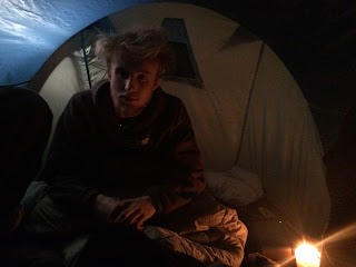
In order to get the light accurate for the scene inside the tent, I decided to put up a pop up tent in my garage, so I could control lighting from inside and outside the tent.

The result was a low key light outside the tent, and the scene being lit by candles on the inside. Here are some test shots I took, exploring wether I could get the desired effect.